Projects/E-Commerce/Hublot Exclusive VIP Shopping Experience on WeChat Mini Program
In this case study, you'll learn about how the Hublot WeChat Mini Program for exclusive members helped the brand sell its entire catalog of limited editions, vastly raising its revenue gains.
About Hublot

Hublot is a Swiss luxury watchmaker, a subsidiary of the French luxury conglomerate LVMH. Founded in 1980, the brand has always strived to "be the first, be unique, be different", following its core philosophy.
The brand has introduced an infinite number of variations with a blend of traditional watchmaking savoir-faire, state-of-the-art technologies, and eye-opening choices of materials.
By 2023, Hublot has nearly 140 boutiques worldwide, over 90 of which are in prestigious locations. In China, consumers can check out its innovative watches in 9 different physical stores.
To expand its reach in this valuable market, Hublot has launched a WeChat Mini Program, a private traffic channel on the country's most popular social media platform.
Launching with a Boom
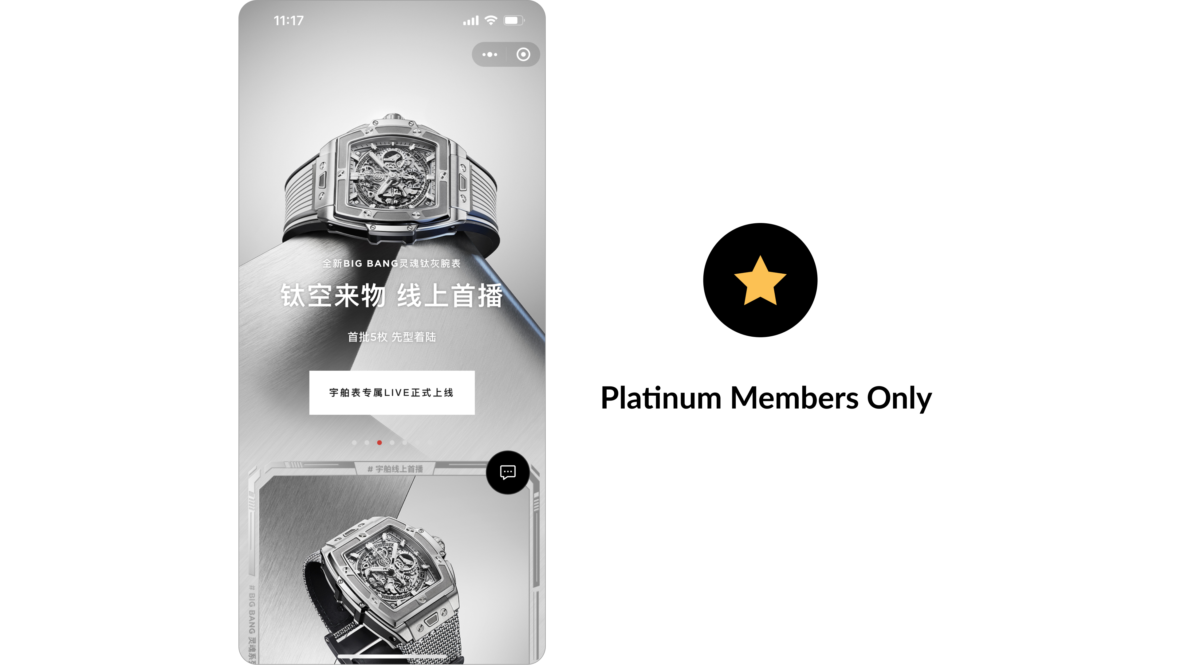
The big launch of Hublot's WeChat Mini Program featured 10 pieces of limited edition worth 168,000 RMB each. But only Hublot exclusive members could access them.
And the Mini Program was a huge success, evidenced by the fact that all of the watches were sold within just 2 hours!
So, how did the brand accomplish this?
Hublot Exclusive Membership
This was in fact Hublot's first online sales channel. And it successfully captured and delivered the sense of luxury of its physical boutiques in the user experience of the brand new online platform!
Deluxe Design (By Hublot's Chosen Partner)
The design of the Mini Program (MP) mainly utilized 3 colors: black, red, and white.
Black represents sophistication, power, elegance, and edge, while red symbolizes passion, attention, and significance. And the contrast of these 2 colors, especially black, the color white resulted in an even stronger impact and impression on the user.
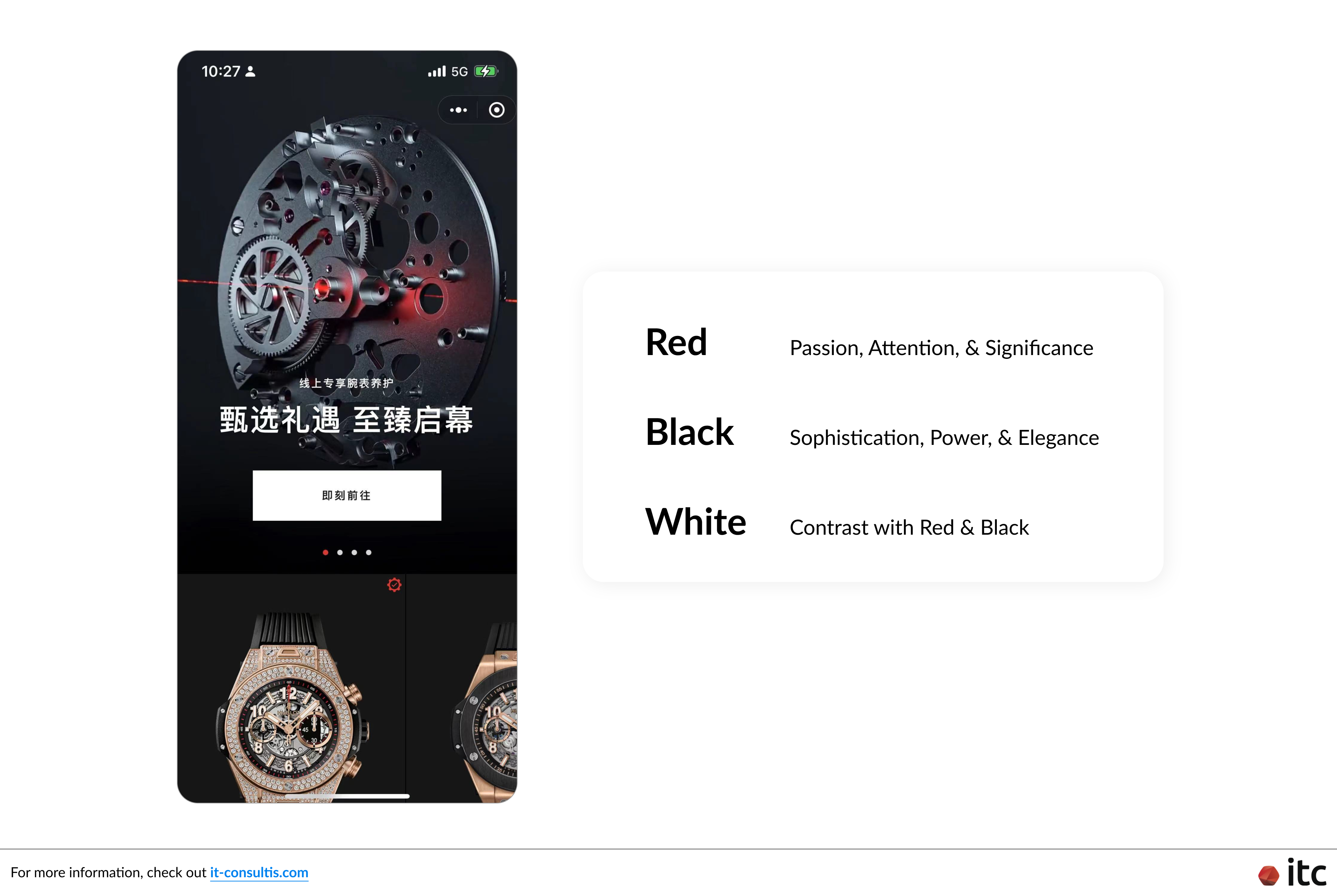
This resonated well with the sense of sophistication and urgency that Hublot Mini Program tried to communicate. And it is especially important for a platform reserved only for exclusive members.
Thus, although the consumer decision-making and payment processes of these luxurious watches are vastly more complex than those of a simple T-shirt, the optimized design of the MP assured users that they would get exactly what they desire.
Pre-Ordering Capability
Due to the limited nature of Hublot's product supply, the brand established a pre-ordering function to boast early promotions, develop hype, and secure purchases quickly thanks to the built-up sense of urgency among fans.
Once the user chooses to pre-order, they need to make a downpayment to temporarily secure their purchase. An SMS will then arrive notifying them that they need to make the full payment within the next 2 - 3 hours or 1 - 2 days (depending on Hublot's campaign) to successfully place a pre-order.
And, if they fail to follow through, the pre-order will be automatically canceled so that the product can go to someone else who would.
Simple Yet Effective User Journey
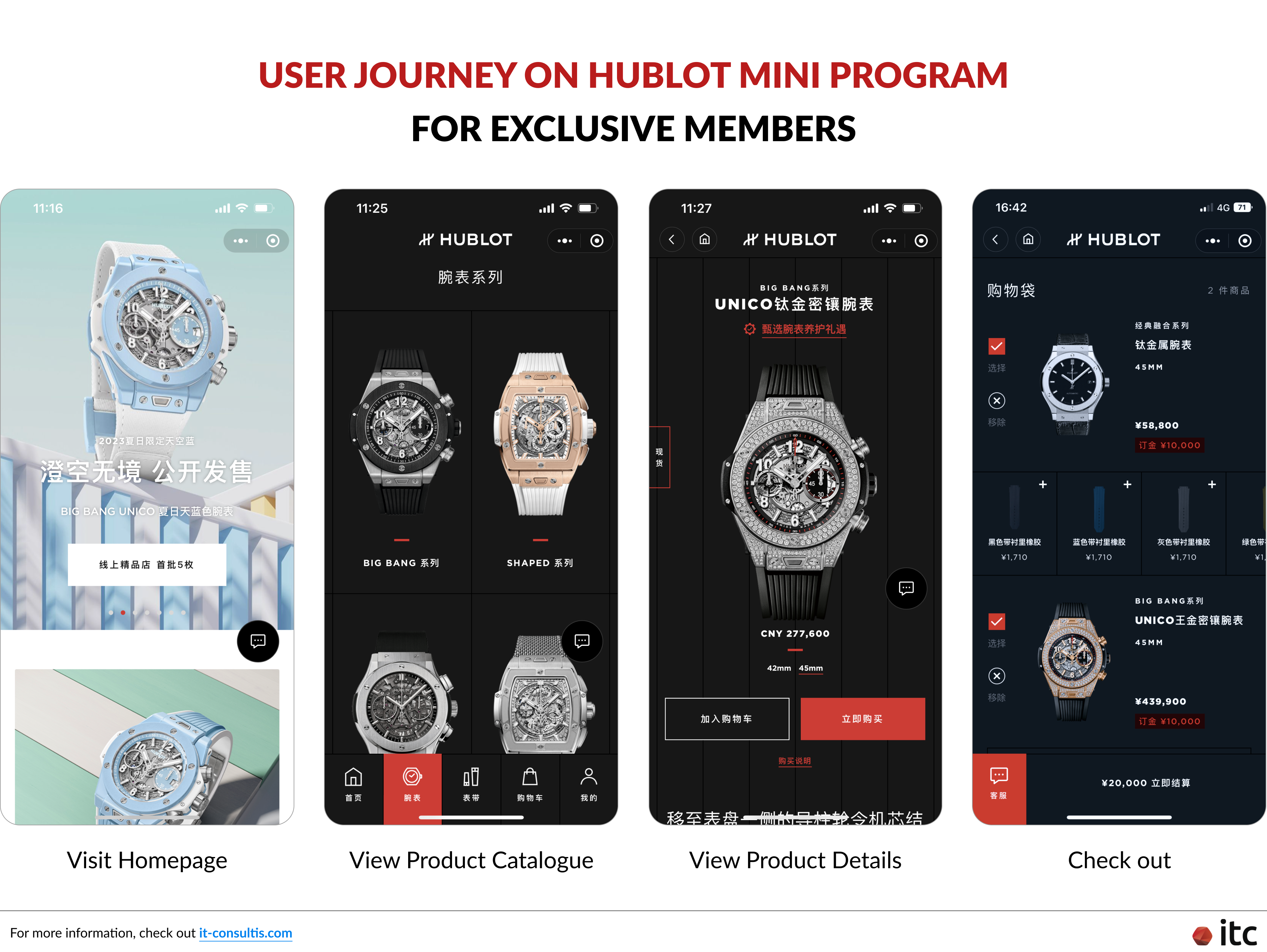
One of the biggest reasons why the Magento-powered Mini Program did so well within just the first few hours was the ease of purchase. Hublot prioritized delivering a straightforward user journey from entry to check-out. As a result, the old-but-gold navigation helped the user to quickly get their favorite Hublot watch in just 4 steps!
Clear Purchase & Order Fulfillment Flow
Aside from the simple and easy-to-navigate user experience within the app, the order fulfillment process was also very well-organized. It ensured that customers can quickly secure their exclusive Hublot watches while the brand could avoid as many stock conflicts as possible.
Here is how it went:
- The buyer made a downpayment
- The stock was secured and reserved for purchase
- The buyer made a bank transfer to wrap it up
- Hublot boutiques were notified of the order
- The shop delivered the product along with clarifications on its After Sales services and Warranty
Live Streaming & Exclusivity
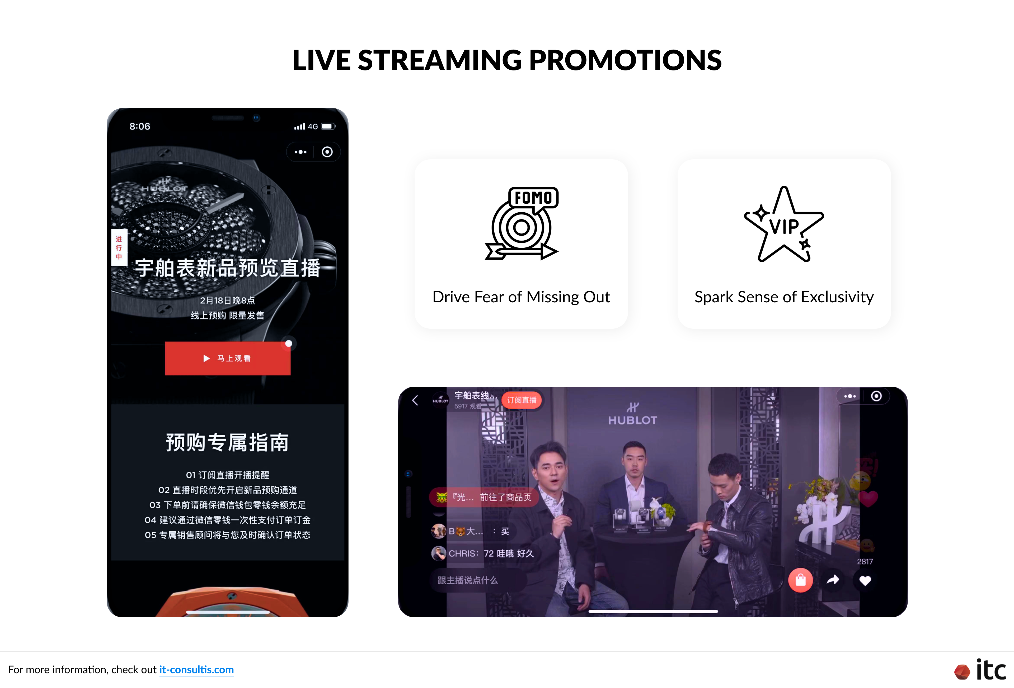
In addition, Hublot also organized Live Streaming sessions to further promote the Fear of Missing Out (FOMO) and spark a sense of exclusivity among its followers.
Newest Developments
After its initial success, the Hublot WeChat Mini Program is still in constant development to deliver an even better user experience to the exclusive members of the brand. Some notable updates are:
Interactive Elements
Another factor that makes the Mini Program so captivating is the interactive blocks added to the Homepage.
As the user enters the MP, they are welcomed with colorful animations of the watches for sale. Users can easily swipe left or right to check out a different timepiece. And each time they swipe, their mobile device would slightly buzz for effects.
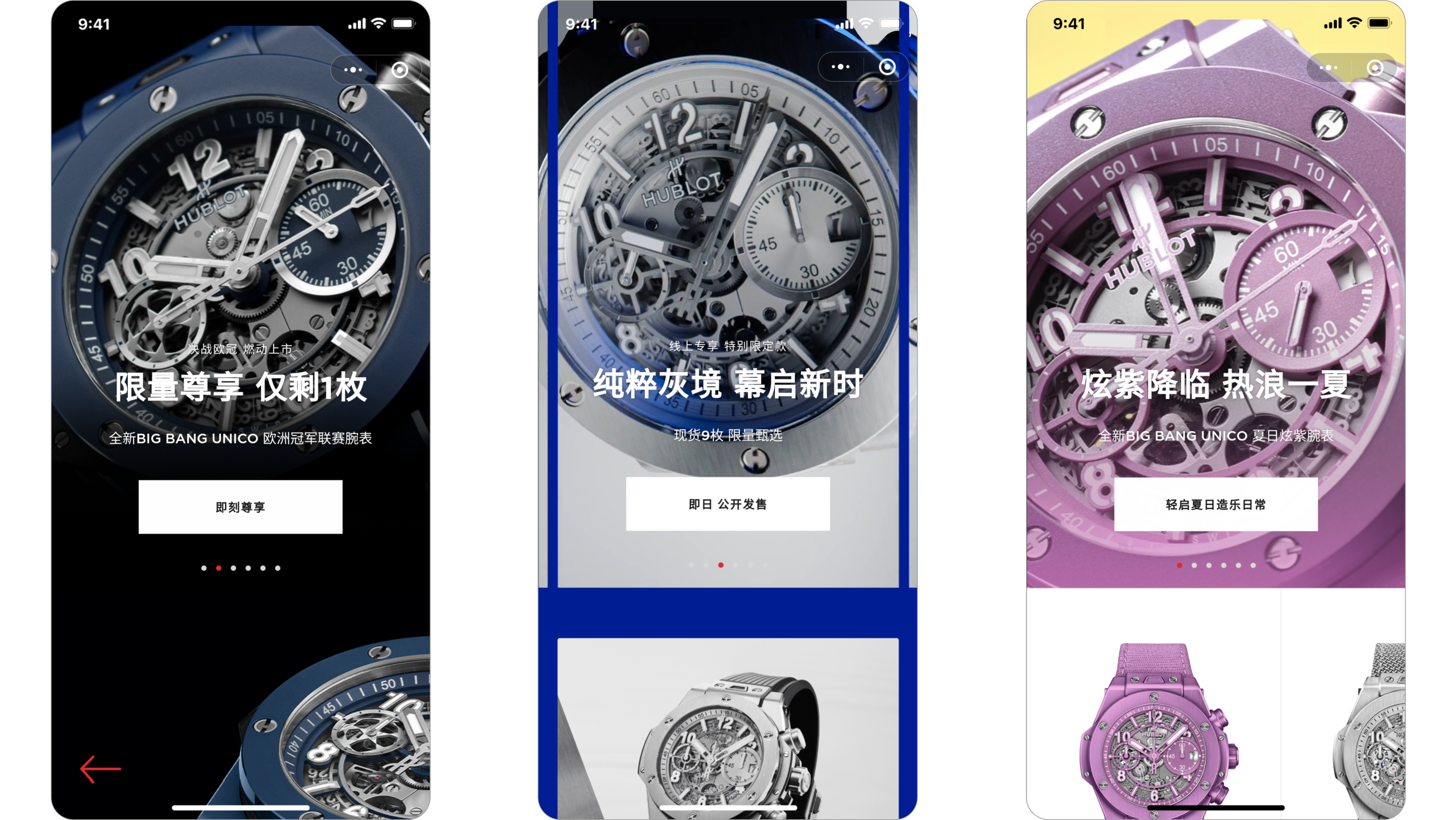
Right below the slider, users can find a block displaying more details about the product visible above. To elaborate, when the user swipes the slider, not only does the animation of the next product appears, the bottom block changes accordingly as well.
Moreover, Hublot also encourages users to actively interact with the MP to gain more information by tapping. Particularly, there are tappable glowing points and text to guide them through the knowledge journey.
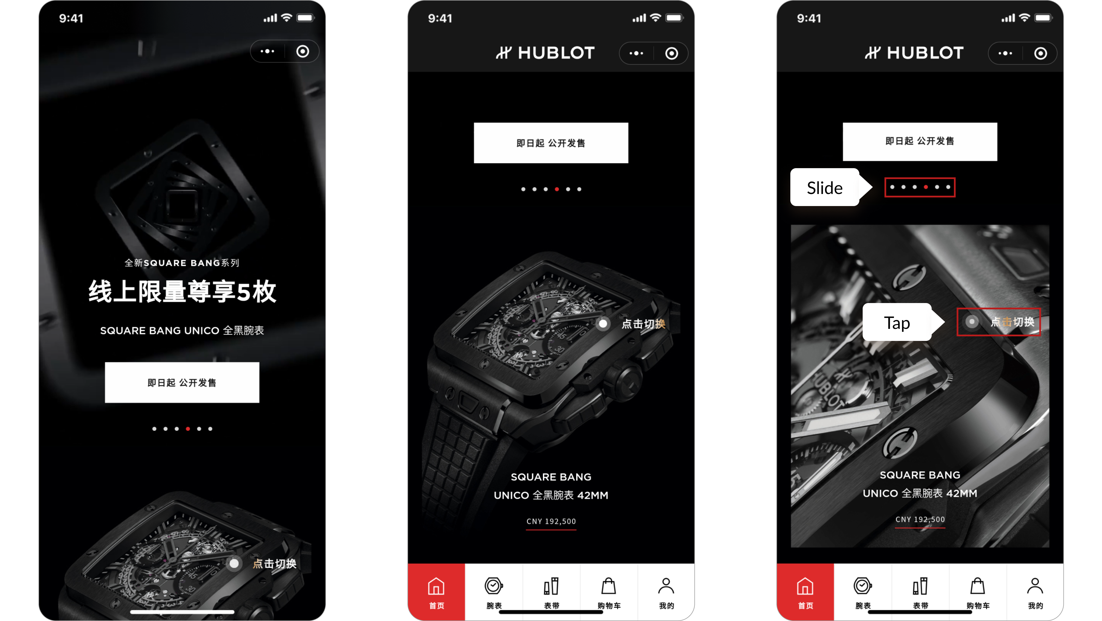
Overall, these elements help keep the users engaged and interested the moment they enter the exclusive online shop.
Dealing with Out-Of-Stock Items
Previously, when a product was out of stock, users only had the choice to reach out through WeChat Customer Service for pre-order inquiries.
Now, alongside the existing method, customers can directly contact a Customer Service operator. The Hublot team, once alerted, will proactively get in touch with the customer using their WeChat ID or phone number (with consent).
Guest Mode Checkout
Another feature that has just been rolled out is the Guest Mode Checkout. This function enables customers to check out without having to log in or create an account.
Since doing so can raise data privacy concerns or is simply considered to be a hassle for many who want to wrap up the purchase of their exclusive Hublot watch quickly, the Guest Mode will definitely improve the user experience while ensuring maximal ROI for the brand.
Key Takeaways
Below are 7 key takeaways brands can learn from Hublot to improve their future China penetration and expansion strategies, especially via private channels like WeChat Mini Program:
- Diversify your touchpoints with customers both offline and online (preferably, form a private platform to maximize your data capture for effective retargeting efforts)
- Every platform should deliver a consistent brand image and customer experience
- Reward loyal premium customers
- Draw attention and encourage purchases with exclusivity and urgency
- Simplify the user journey to enable customers to reach the checkout process with minimal difficulties
- Develop a clear order fulfillment flow to minimize errors
- Utilize live streaming to boost traffic and sales
ITC handled the backend of this Mini Program project, while another partner was responsible for building the interaction and frontend. For more information, press the "Launch" button below, scan the QR code, and explore the Mini Program yourself!


