Projects/CMS/A Website Revamp for ESSCA International Business School
In this IT Consultis case study, we will show you the revamp of the ESSCA website with the integration of the CMS API and React.js inside Docker.
About The Client: ESSCA
Founded in 1909, ESSCA is an internationally renowned French grandes écoles. It offers a wide portfolio of diploma-level programs and degrees in business and management.
For over a century, ESSCA has proven its academic excellence and international perspective with many impressive numbers and prestigious accreditations. This includes being among the global top 1% of management schools triple-accredited by AACSB, AMBA, and EQUIS.
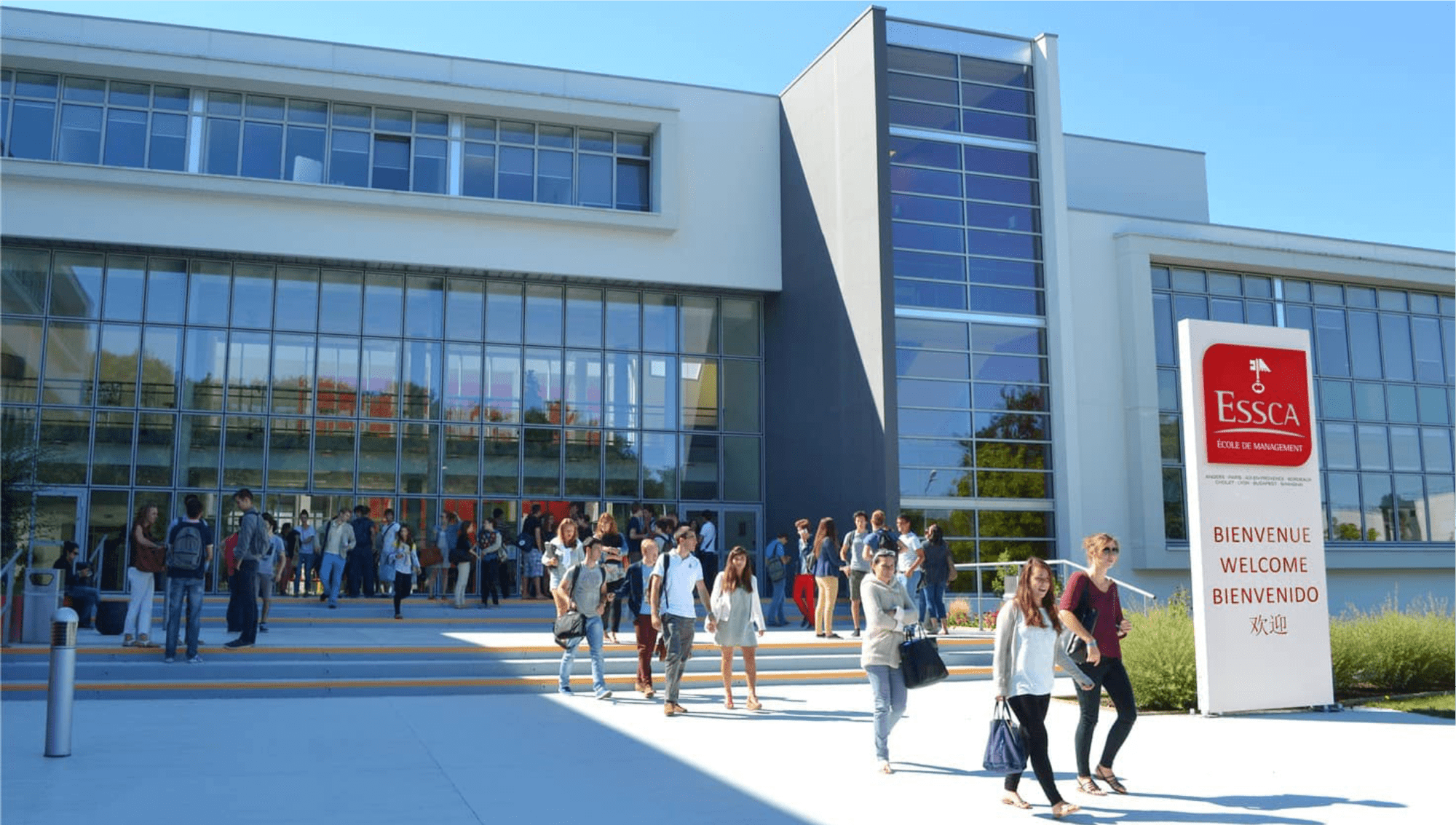
In addition, to enhance its global expansion, ESSCA has now opened 8 different campuses to accept students from all over the world. As a result, the school welcomes a huge amount of web traffic every day from its current students, faculty, and partners to millions of potential stakeholders worldwide.
Therefore, it is essential for ESSCA to take great care of its website, from branding, copywriting, and design to the content management system. The website has to properly convey ESSCA’s image while providing a seamless experience to users from different locations.
And this is where IT Consultis (ITC) stepped in.
Objectives
According to Noel-Levitz, Inc., “1 in 4 students reported removing a school from their prospective list because of a bad experience on that school’s website.”
This finding points out that a well-designed website is extremely important for every university, especially those that welcome a large number of students from different countries, such as the ESSCA School of Management.
However, over the years, the school's website had aged and, naturally, did not keep up with the latest design trends.
One of the biggest issues with the website was its poor mobile responsiveness. As more and more users now prefer to go online via mobile devices, ITC needed to ensure that ESSCA's website was fully mobile responsive to enhance the user experience and properly convey the brand image.
The second challenge that ESSCA was facing was a disseminated content management system.
The school had a lot of related websites, each of which covered similar topics. Although these websites were centralized under the same backend system, some of the features were very different. This cost ESSCA a lot of time and effort to manage such a huge amount of content.
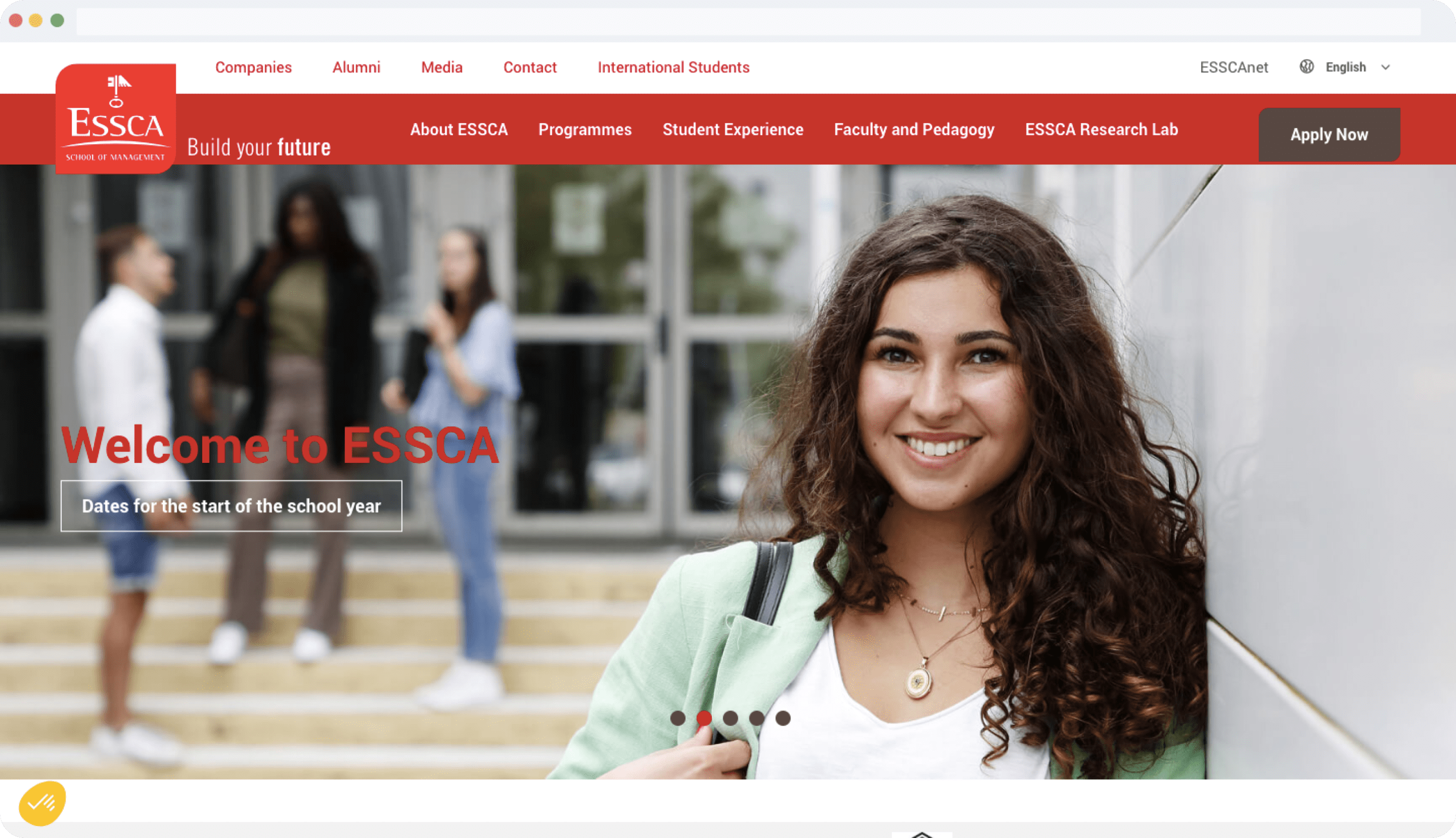
Ultimately, ITC set the following objectives to help the world-renowned French management school optimize its website:
- Revamping the whole design following the latest design trends and ensuring its mobile responsiveness
- Unifying all related websites under the same backend system with the same features
- Simplifying the back office
- Improving the frontend performance
- Simplifying the content organization
Solutions for ESSCA
To help ESSCA revamp its website, ITC provided a full package of services including Consulting, UI/UX, front-end development, back-end WordPress development, DevOps, and Architecture and Quality Assurance.
Read on for more details:
Web Design Revamp
To ensure the most optimized UI/UX, we decided to redesign 100% of the ESSCA website. However, we kept the initial color scheme - red and light brown - to maintain ESSCA’s brand identity.
Generally, ITC fully refreshed the overall layout with the most up-to-date web design principles. The most prominent change was that all of the space was utilized and the user flow became more comprehensive.
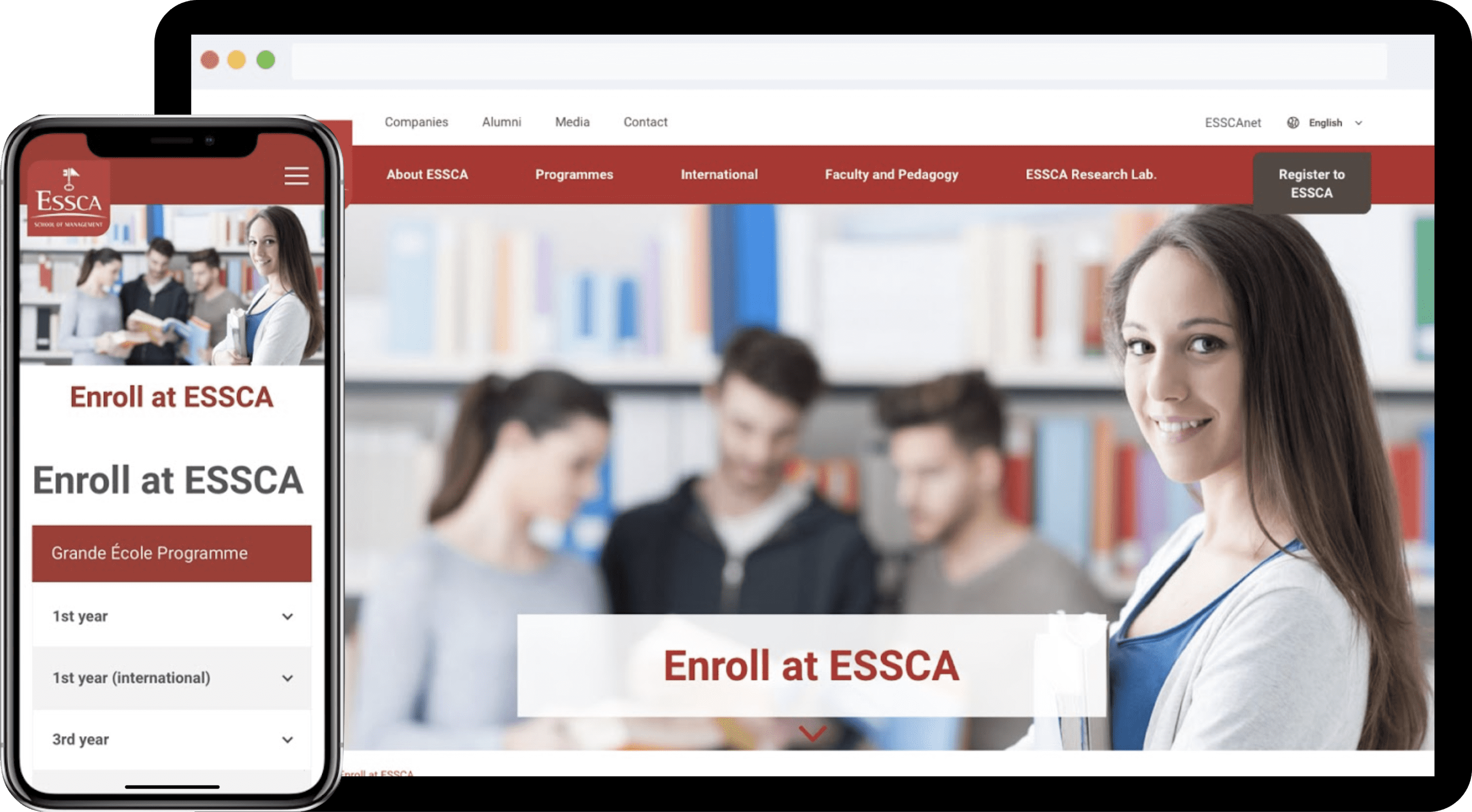
In addition, all elements followed the latest trend - flat design, from the menu to CTAs. This brought a more modern feeling to the website compared to its old version.
At the top of the webpage, there was a clear Main Menu containing the most important pages of the ESSCA website. Notably, we made sure to place the 3 main CTAs - Register with ESSCA, Discover, and Our Programs - in strategic positions to optimally direct users to the key content.
Moreover, the carefully designed front-end effects also contributed to a seamless movement between tabs.
And below the Main Menu, ITC put a top banner with images of smiling students as the spotlight of the Homepage. This would help convey the school's image and attract and inspire visitors at their very first sight.
In terms of the main body of content, we decided to present it in new layouts inspired by the university pinboard. Users can navigate to different pinboards representing different categories without leaving the Homepage. Each pin is a preview and a click on it will direct the users to the full content.
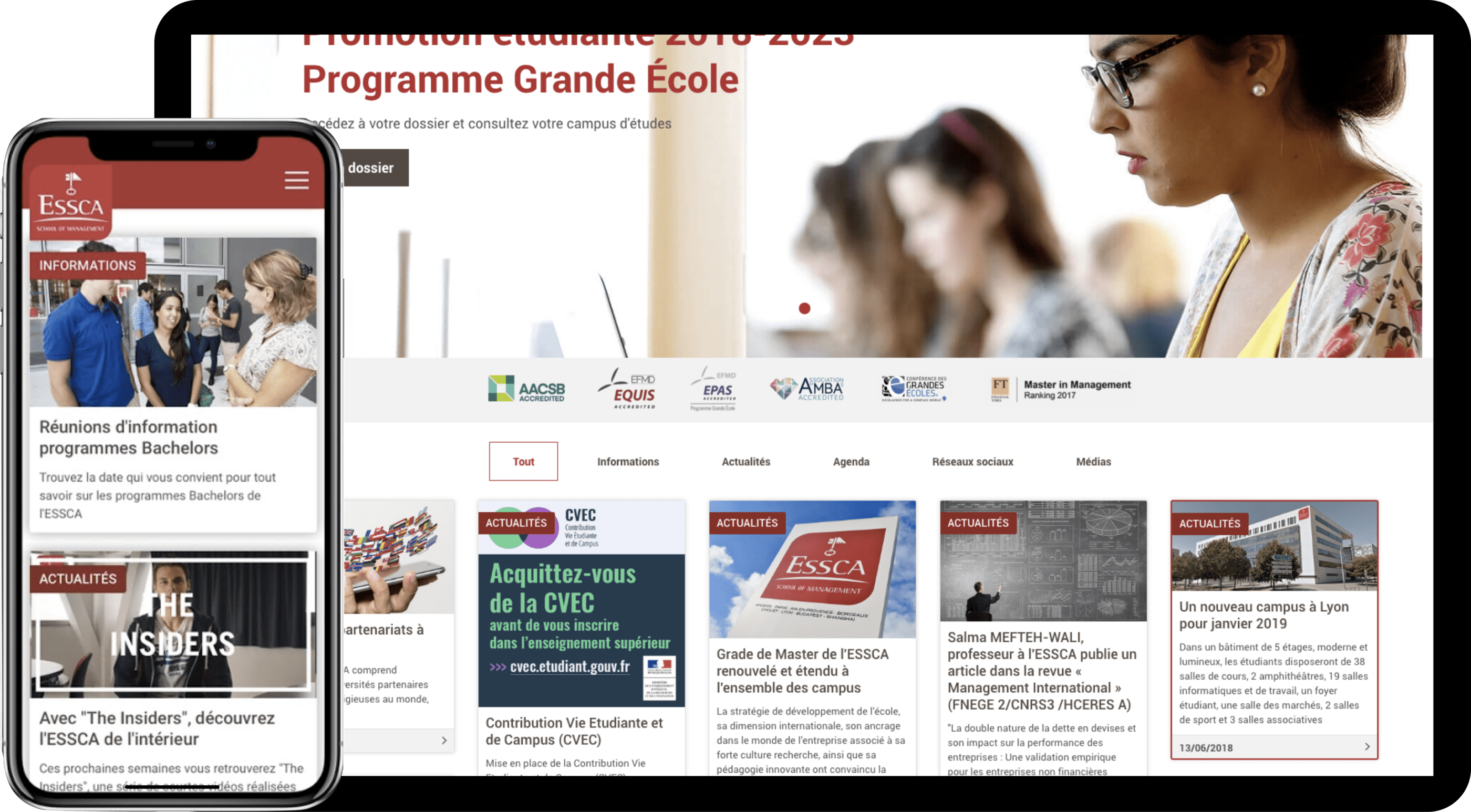
Furthermore, ITC also integrated more beautiful front-end effects to enhance the user experience. This included toggle effects, image zoom-ins, interesting effects that appear when loading the next pages, etc.
Lastly, we ensured that the website was fully mobile responsive to deliver a consistent user experience across all devices.
Performance Improvement & Technologies
Previously, ESSCA had multiple websites, including the main one, dedicated to the same topic. Unsurprisingly, this made it difficult for the admin to manage the huge amount of content while confusing the users in their search for information.
Therefore, in order to solve this problem, ITC made sure that everything could be managed from one back office.
In particular, we chose React.js as our most preferred library for frontend development because:
- Its component-based architecture allows developers to modify dynamic elements in the most optimal way
- React components are highly reusable, making it easier to maintain the code in the long term
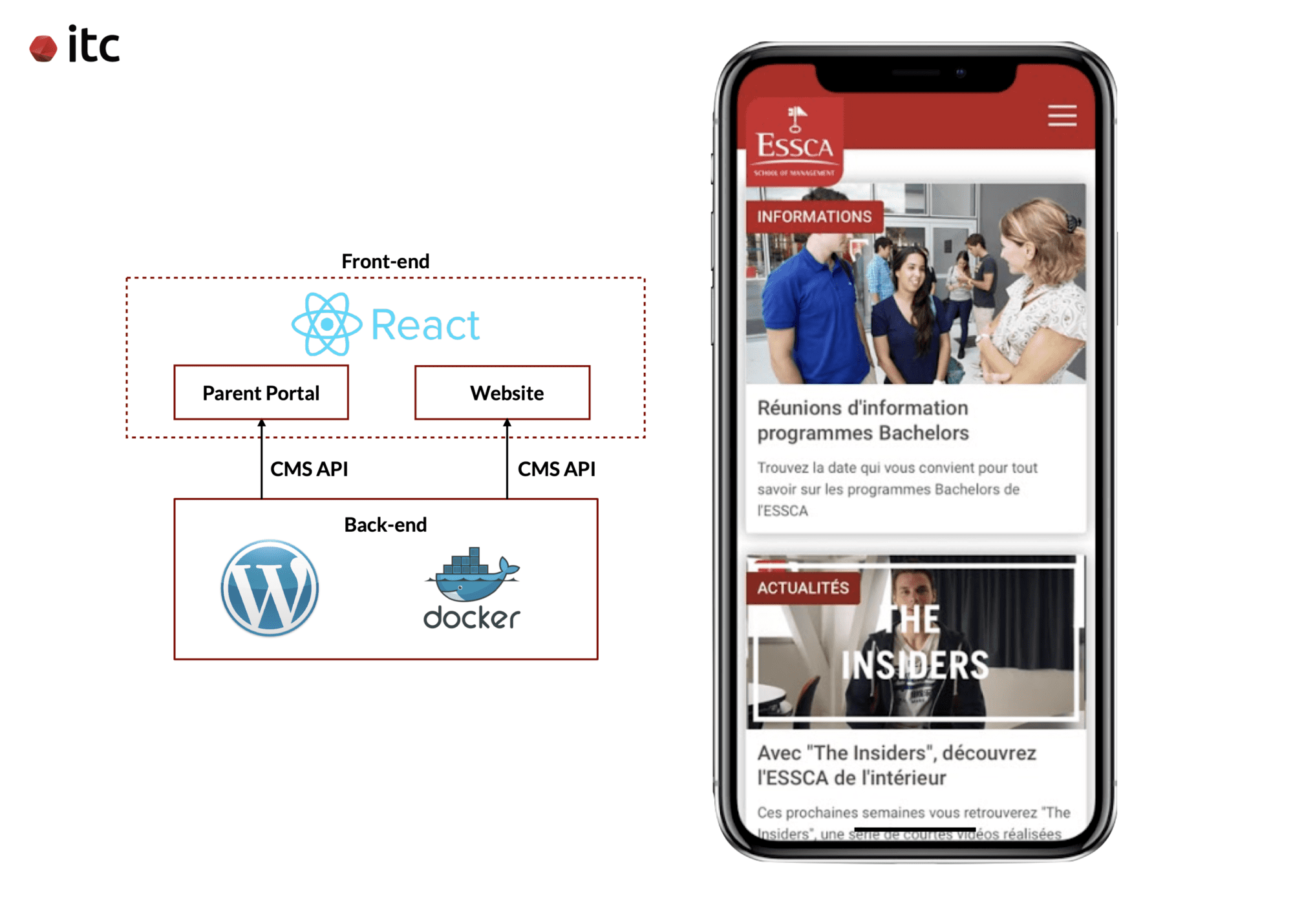
Additionally, we adopted the headless approach with WordPress Headless technology. By using the CMS API, we could easily send the data from the backend to the React.js frontend.
Aurelien - a backend developer shared his experience during the project:
"The integration between the CMS API and React was occasionally troublesome and required close collaboration between the front-end and back-end developers to find the best solution.
Anytime it was needed and not covered by WordPress API, we created some custom endpoints to get some specific data in a specific format for React.
Another technology that we applied for ESSCA’s website (and all of our projects) is Docker - an open platform for DevOps to easily build, ship, and run distributed applications. ITC often uses Docker in our projects to avoid the conflict between different environments - local, staging and production, ensuring the standardization and productivity of the digital assets through a process of Continuous Integration (CI)."
And, thanks to the seamless integration between the CMS and React.js inside Docker, ITC managed to integrate all of the related content into the same website.
Despite the large amount of information, the layout was still very clean and easy to follow. Moreover, this unification also made it much easier for the ESSCA team to manage.
Portal for Parents
Another feature that we developed for ESSCA is a portal for parents to access information about their children. For example, the programs, school regulations, academic records, and so on. Only the parents could have access to this portal with their username and password.
This portal was hosted on a third-party platform. However, it still followed the same visual identity as the main ESSCA website and was manageable under the same back-end.
By providing a customized page for parents, the parents of current students could easily access necessary information without getting overwhelmed by the information on the main page. And, it was also a good way to attract the parents of potential students who were doing research for their children's future programs.
Results
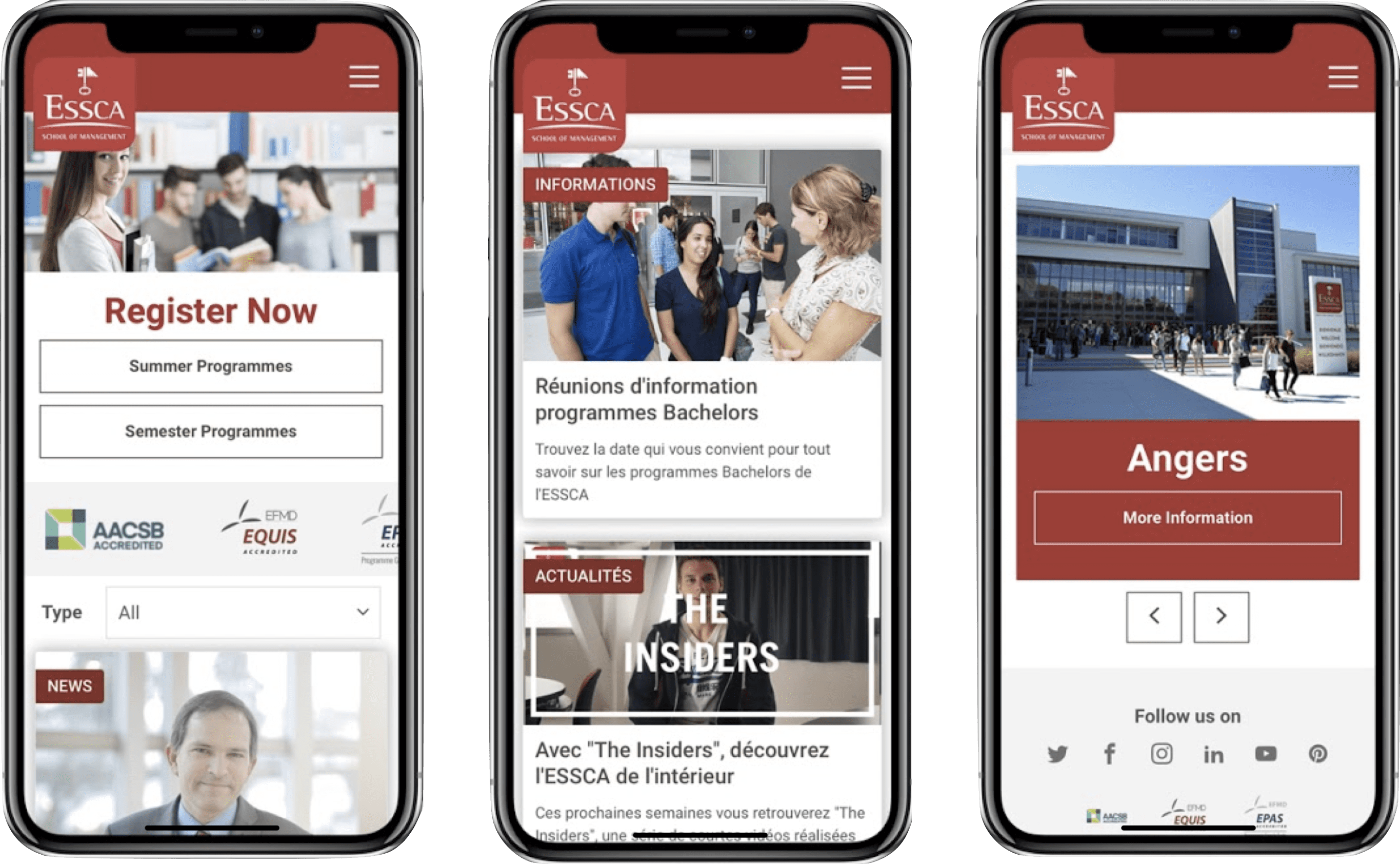
Thanks to the use of modern web technologies, ITC managed to fully revamp ESSCA’s website. This resulted in:
- A trendy and professional design
- An optimized front-end performance
- A more centralized and manageable back-end system
- A seamless experience on both desktop and mobile devices
- Easy access for parents on a separate portal
And, with an enhanced experience on the official online channel, ESSCA could improve the satisfaction level of current students while raising the number of prospective students going forward.
Does your website meet the current user needs and design trends?
IT Consultis is a digital transformation agency with over 10 years of expertise in consulting and delivering tailor-made digital enablers.
Hit us up to discuss your online presence makeover and optimize your user experience and lead generation capabilities!


